When Colours Find Harmony: Agra Red and Moonlit Ivy Table Styling
Every once in a while, an order comes through that stops us mid-scroll.
Not because it’s big or complex, but because it makes us go, “Wait… that might actually look stunning together.”
That’s exactly what happened when Roshni from Noida placed her order. She picked the Moonlit Ivy hand block printed tablecloth with placemats from our Agra Red collection — a pairing we’d never thought of styling before.
And of course, curiosity got the better of us. So we decided to try it!
The Base: Moonlit Ivy Tablecloth
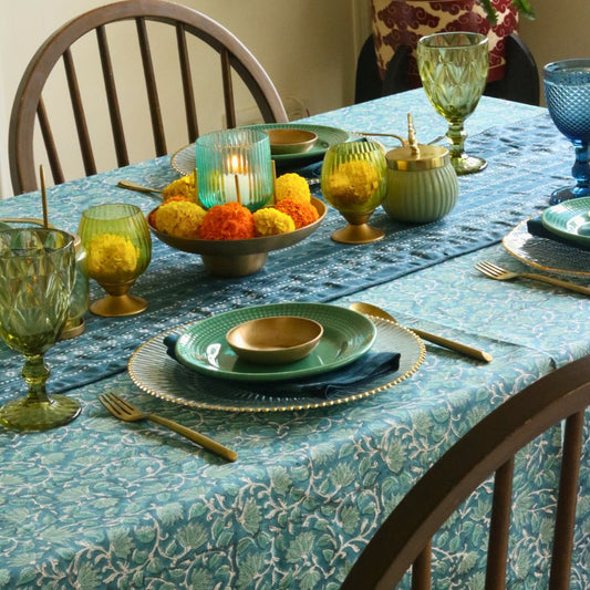
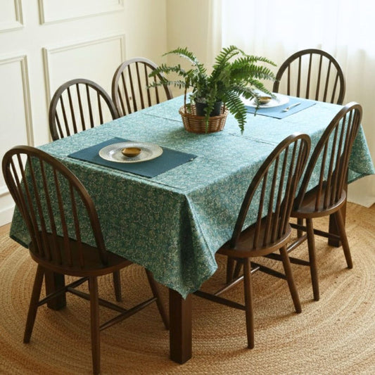
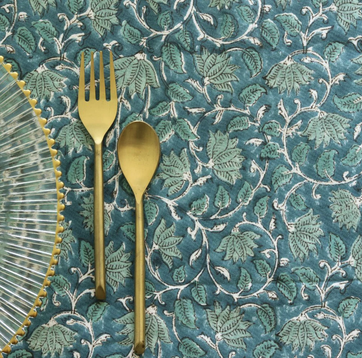
There’s something about Moonlit Ivy that feels like a deep breath. Printed by hand in calm teal tones, it carries a stillness — the kind that reminds you of leafy courtyards under moonlight. The delicate vines wind their way across the fabric, each block print mark telling its own quiet story. Its blue-green palette brings a sense of balance to any space, adapting beautifully to both natural daylight and warm evening hues.

Two Moods : One Canvas
How do you make two opposites — a cool, watery teal and a warm, terracotta toned color live together on the same table? We were curious on how to answer this so we styled it in two ways:
1. The Formal Dining Look -
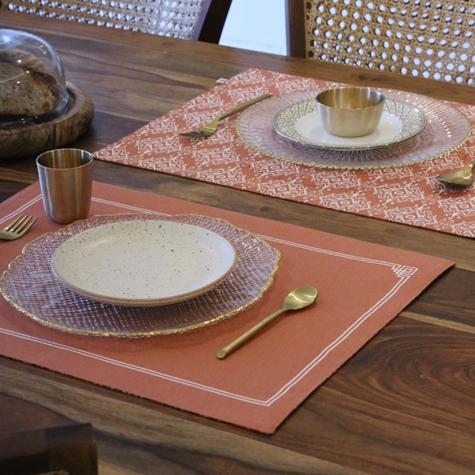
For the formal setup, we used the Agra Red rectangular placemats — the solid side, simple and clean. The warmth of that terracotta red instantly grounded the soft blues of Moonlit Ivy. On top, we layered it with a clear glass plate for that formal dining experience and added a touch of the dusty rose napkins which pops out the colour instantly. Touches of brass and gold — from the cutlery to the small katori and glass — brings in that subtle festive and formal glimmer. Not loud, just enough to catch candlelight and reflect it softly across the table.
It looked like something out of a slow evening dinner — glowing light and conversations that linger. The geometry of Agra Red mirrored the rhythm of Mughal stonework, while the vines of Moonlit Ivy danced quietly beneath it.

2. The Casual Brunch Look -
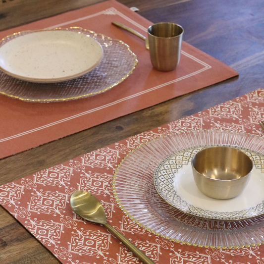
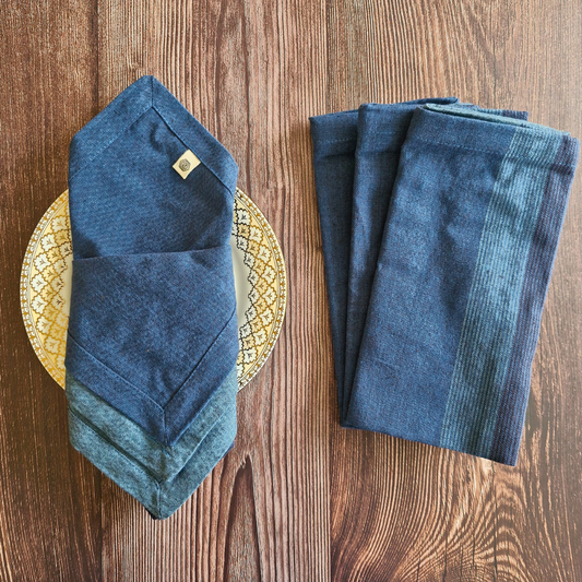
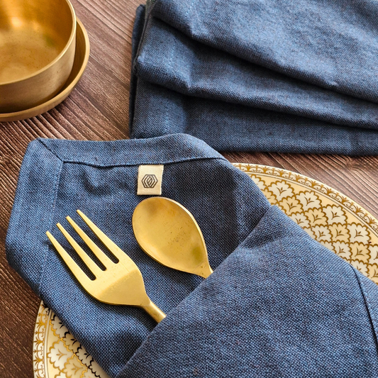
Then came the fun part — the casual brunch setup. Here we swapped in the Agra Red scalloped placemats, paired them with woven Aegean blue napkins.
The Agra Red scalloped placemats bring a rush of warmth and life. Its deep terracotta-red hue, patterned with intricate Mughal motifs, creates a burst of contrast — a sunlit moment against all that cool blue. It’s bold, detailed, yet easy on the eyes.
We softened it with Woven Aegean Blue Napkins, folded neatly beneath a coral-pink plate, and a textured blue glass that catches light like ripples on water. The rose gold cutlery adds just enough shimmer — not to glamorize the setup, but to remind you that even everyday meals can feel a little special.

When Colours Found Their Harmony
From a design perspective, Red and Blue sit on opposite ends of the colour wheel and are what colour theorists call complementary colours — opposites that heighten each other’s beauty when placed side by side. It’s this conversation of opposites that makes them so magnetic.

Where red radiates warmth, passion, and grounding energy — blue and teal bring calm, depth, and openness. Together, they create tension and balance — that magical push-and-pull that keeps the eye engaged.
These tones were never meant to meet on paper but when they came together, they created something quietly extraordinary. It reminded us that beauty doesn’t always come from matching — sometimes, it blooms from contrast.
Like in Kerala mural paintings, where deep indigos and burnt oranges dance side by side, this table too found its rhythm in opposites — calm and bold, earth and sky, tradition and touch.

Maybe it’s because both designs share the same soul — the patience of hand block printing, the devotion of the artisan, the timeless rhythm of heritage. They seem to understand each other beyond colour, beyond pattern — as if cut from the same story.
A New Chapter That We Learnt Today -
Some tables teach you more than design — they teach you feeling.
This one reminded us that contrast doesn’t always mean conflict; sometimes, it’s the secret to harmony. Maybe that’s what craft really is — a conversation between opposites, between earth and sky, between what’s expected and what surprises you. And somewhere in that meeting of pattern and pigment, we found something quietly powerful — the beauty of balance, the poetry of colour, and the joy of breaking our own rules.
Because sometimes, all it takes is a table like this to remind you: art doesn’t follow harmony; it creates it.


